As we celebrate the 50th anniversary of Special Olympics, we are taking a look back at the #50moments that have defined the Special Olympics movement here in B.C. and throughout the world.
Over the 50 years of Special Olympics internationally, and the 39 years of the movement here in B.C., the organization has grown and changed so much, progressing from a one-time event to year-round, high-quality sport programs with thousands of inspiring athletes and dedicated volunteers, sponsors, families, and supporters in 174 countries and 55 communities throughout our province. Through those years, Special Olympics BC’s logo has changed correspondingly, reflecting our spirit, our mission, our community, and our part in this life-changing global movement.
At our founding, Special Olympics BC adopted a British Columbia version of the national Special Olympics Canada logo. In 1983, Simons Advertising created a new multi-colour logo (pictured at right) that was intended to draw attention to the organization and spotlight the values of community, sport, and learning inherent in our activities.
The shapes in the logo were linked together to highlight the idea that, whatever our differences, we can work together to enrich our own lives.
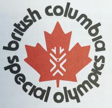
In 1987, Special Olympics BC returned to the provincially specific version of the Special Olympics Canada logo, showing our participation in this movement reaching from coast to coast to coast to change lives and create inclusive communities nationwide. In 1990 and 2000, SOBC adopted anniversary versions that celebrated the decades of growth and achievements by the inspiring people who make up the SOBC family in our province.
SOBC used the Canadian logo for nearly 20 years. In 2006, Special Olympics Canada and the provincial and territorial Chapters decided to adopt the international Special Olympics logo in order to minimize confusion and maximize the spirit of community and opportunities from the international awareness efforts and resources.
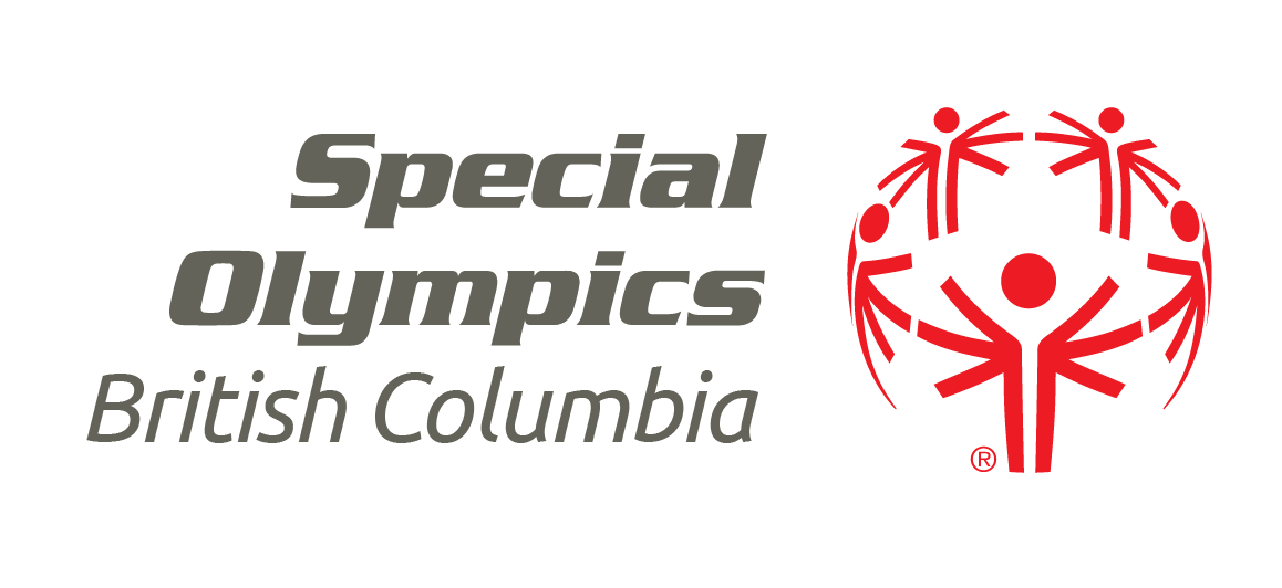
The international logo includes the symbol with five people who each have six arms. Special Olympics athlete Nate Gerharz of Wisconsin wrote the following summary.
“The logo has five people who each have six arms. The “down” position means downtrodden, remembering a time when many people thought we were not able to make good decisions or try new things. This describes my life before I became involved in Special Olympics. I had few friends and spent most of my time alone.
“The straight arms mean ‘equal’; we are the same in many ways. When I joined the Special Olympics swim team I found out I was the same as everyone else. No one cared that I could barely read or write. No one laughed that I was a lousy swimmer. For the first time in my life, I felt accepted for myself. I believe that acceptance gave me the determination to become the best swimmer I could. It also taught me how to be a friend and not judge others by what they cannot do.
“The arms raised represent ‘joy’ and realizing our ultimate goal. All goals should be challenging but reasonable. I have reached my goal of learning to swim, but now I have raised the bar and will advocate for a better swim program. … I continue to work on my reading and writing skills, but I have become a Special Olympics Global Messenger and have spoken to crowds of more than 600 people.
“The five people represent the five continents involved in Special Olympics at the time the logo was made. The people are placed in a circle to represent the world. It is pretty overwhelming to think when you look at the globe, there are Special Olympics athletes and volunteers in almost every country, people who are like you and me.”
Six years later, after extensive global conversations and research, Special Olympics International launched an updated logo and brand vision with the guiding philosophy of “revealing the champion in all of us” and an emphasis on telling the remarkable stories of this empowering movement.
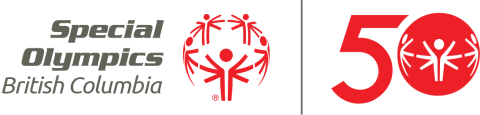
That Special Olympics logo is used today throughout British Columbia and all over the planet. It is a bright and easily recognizable combination of Special Olympics Red and Special Olympics Grey colours, and it employs the Ubuntu font. Ubuntu is a font family that’s easier to read for individuals with intellectual and learning disabilities, and its name means “I am because we are.” Special Olympics International also introduced a 50th anniversary version that celebrates this milestone year.
The current Special Olympics logo and brand vision call for all of our marketing material to reflect the personality of our empowering movement: inspirational, joyful, inclusive, determined, courageous, and authentic. Today SOBC uses international templates and resources to create marketing tools that all highlight our amazing athletes and volunteers, and the inspiring spirit and values of our organization. Please click here to learn more and view resources for Locals